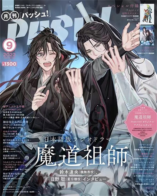
PASH! 2023 Illustration file GEAROUS Staff Comment
Production Secret Episode: We asked the Production Staff all about the gorgeous illustrations GEAROUS sensei handles for the “Madou Soshi” Radio Drama.
The Genbu Grotto^1 illustration contains everyone’s combined effort and feelings.
 ALT
ALT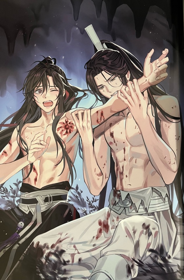 ALT
ALT—What do your production requests look like when GEAROUS-sensei creates an illustration for you (e.g., a jacket illustration or a numbered episode cover illustration)?
For the episode title cards or CD special insert illustration, on our side, we specify a desired scene or theme for each episode, and the characters, and place the request to the artist. For example, for the title card for Season 3 Episode 1, we specified “BouSen (=WangXian) together, Hyakuhou Mountain^2 kissing scene”. The flow for each season’s key visuals and the CD jackets [starts with] the standard BouSen pair without any additional details about the specified scene from our side; we leave the rest to GEAROUS sensei, then we pick one from the numerous rough drafts they submit, and give our thoughts on revisions. Materials for PASH! can go either way, and depending on the which episode is being published in each issue, in order to recreate the scene from the source material, there are times [a scene] is specified from our side, and others where we specify only the characters and the time of year, and leave the rest to GEAROUS sensei. In the event of a collaboration or an exhibit, we basically specify the theme and characters on our side, and hand over specific references for poses and costumes based on that theme to the artist.
—What sort of back and forth do you have during the production process?
On our side, it isn’t so much about the presence of specifics or lack thereof; the workflow is Basic Sketch → Colored Rough Draft → Completed First Draft → Final Adjustments. When we send a retouch request, it’s not just character poses or their line of sight, we consider the illustration’s use, the layers, the composition, the camera angle, the color saturation, head-to-body ratio, etc. There are cases where we’ll send revisions for even the tiniest of details. In the case of title cards, because they change size based on their use—whether that’s on the [MiMi FM] app, on X (formerly known as Twitter), magazine publications—we submit revisions to make designing easier, like “pull the camera out a little bit” or “supplement the hands and feet, and hem lines.” In the case of the CD jacket illustration, they’ll be full-sized large panel displays in storefronts, so we asked GEAROUS sensei to “split the BouSen layer in order that they could be used individually,” but no matter how much we fussed with it, in the end, we chose the illustrations where they couldn’t be separated. Whenever they’re made into full-sized large panel displays, I laugh thinking how huge they are (laughs). Otherwise, regarding BouSen illustrations, we have meticulously consulted with the artist about accessories and hand placement, line of sight, etc., in order to bring out the sexual allure. For example, the “PASH! Jan 2023” cover illustration—we received an illustration of the two just getting out of the bath, without even their belts tied; originally, Gi Musen (=Wei Wuxian) was supposed to have shoes on, but an internal revision arose: “wouldn’t it suit the ambiance better and be even more erotic if he was barefoot?” so we sent GEAROUS sensei a revision request. Speaking of lines of sight, Sensei has a consistent setup of basically “Ran Bouki (=Lan Wangji) only looks at Gi Musen”, and that’s magnificent, so we staff want to keep with this configuration.
—Could you staff folks speak about what you feel is the allure of GEAROUS’ illustrations?
First of all, they have much better proportioned faces than average! We’re all attracted to good looks, so we love GEAROUS’ illustrations. Also, they send in such detailed scenes for us. We already spoke about Rand Bouki’s line of sight, but on top of that, I think it’s magnificent how elaborate they were with the details, from how they put Ran Bouki’s headband on Gi Musen, or the way they put BouSen’s accessories’ image colors on each other. And not just BouSen, but the other characters’ designs were spot on too. Every time we order an illustration for a newly introduced character, we’re filled with excitement that it’s just so “This is it! This is what they look like!!!” at a single glance. We’re blown away by how much illustrations with new original costumes for event exhibitions exceed our imaginations too; we may have sent the references, but we’re moved by the theme, and by the how well the costume designs complement each character, down to the poses. Moreover, I think that the composition of GEAROUS’ illustrations is fascinating. While we do have some specifications from our side, the artist will compose a variety of roughs for us from the same scene, and they’re all fabulous, so picking a single rough sketch is a struggle.
—Does the production staff team have a favorite illustration out of all of the ones GEAROUS sensei has handled to date?
It has to be the Genbu Grotto image from the PASH! September 2022 edition. The image decorating the [magazine] cover was quite the shocker (laughs). Also, since I’ve seen comparatively few illustrations of the Genbu Grotto scene, I thought it was an especially memorable piece personally. It was a first-time challenge making somewhat different [illustrations], and I’m glad it had great reception from the fans. Actually, we did not decide to have two different illustrations from the get go. The fully clothed version came first, and because none of the Chinese staff had really seen BouSen naked, nothing felt out of place, but then the Japanese staff pointed out, “aren’t both of them shirtless in this scene?” so we double checked the source material and the radio drama scripts, and they had indeed taken their clothes off. However, having them half naked and biting an arm on a magazine cover was rather sensitive, so the staff opinions were split as to whether to be faithful to the source material and request the revised illustration, or to proceed with the fully clothed one. Then [our contact at] PASH! proposed, “why not use both…?” and all of the production staff thought that the best course of action, so we discussed it with the artist. GEAROUS sensei was incredibly cooperative, and promptly made the second image for us. Both illustrations are absolutely phenomenal, so, in the end, I think using both was the most correct answer. Even at the time of the notice, it stirred up statements like “the illustration will evolve”, and everyone was excited. I think that illustration contains everyone’s combined efforts and feelings.
—Are there any aspirations(?)—projects you wish to pursue—together with GEAROUS sensei going forward?
Illustrations with the original radio drama character designs are a given of course, but we’d also like to see the “Madou soshi” characters in different costumes. Going forward, we’d like to challenge [ourselves with] various themes, and when I was able to meet with GEAROUS sensei, we also had an enthusiastic conversation about what themes they wanted to do for upcoming episodes. Both we and GEAROUS sensei have already come up with prospective themes we want to do, and I absolutely think we will be able to make those a reality soon. Moreover, the radio drama is embarking on its third season, so the distance between BouSen should close even further. On the illustration side, I want to see more illustrations of BouSen packed with a different sort of eroticism than they have ever done before.
And from GEAROUS-sensei themself...
–GEAROUS sensei, Is there anything you are particularly conscious of when illustrating for “Madou soshi”?
When I draw Ran Bouki, I make an effort to dra him with a robust physique. He has a gorgeous visage, but I think he’s rather strong and well built, so I draw him such that his physical strength can be felt from even outside his white robes.
In Gi Musen’s case, I pay special attention to his facial expressions. I draw him bearing in mind that “his smile is remembered as someone’s first love”; I think his smile holds an unforgettable mystique to the person thinking of him.
When I draw them together, I make an effort to present a change in atmosphere, especially around Ran Bouki. Even if his face bears the same old cold expression when he’s with Gi Musen, it has some softness somewhere. I pay meticulous attention to expressing that ambiance.
NOTES
^1: 玄武洞; “Xuanwu Cave” or something like that. I didn’t find a 100% match in my very brief review of the books.
^2: 百鳳山; 7S vol 3 chp 15 pg 259 uses “Mount Baifeng”. ExR chp 69 uses “Phoenix Mountain”.